

Etsy Mini is Too Big!
So excited about my the shop and launching my website. Hexe Knits is ready to take over the world! I've been a web developer for over 15 years, helping others to build their businesses and follow their dreams, and I've decided that now it's my turn. Such a blast to build my own site.
Other things, though, haven't been so easy and I'm getting to learn them the hard way. For instance, turns out I really stink as a photographer and don't know much about marketing. My 14-year-old daughter is helping me navigate the tangled web of social media, and I'm up to 56 followers on Instagram. Woo!
Once the site was launched I started to explore Etsy more and see what they had to offer their sellers in the way of tools and fun little doo-dads. Coupon codes seem pretty straightforward and I'm loving all of the stats. Admittedly I'm a little keyword obsessed at this point... ("Hey, someone searched for 'orange hat.' I'll make a million orange hats!")
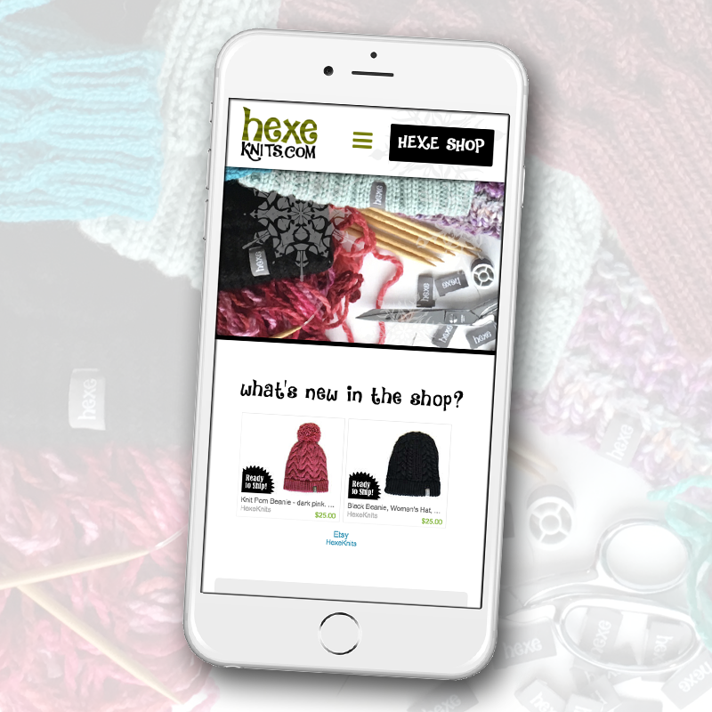
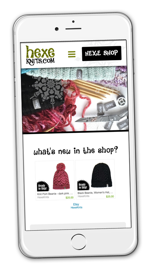
The one thing I think could use a little improvement is the Etsy Mini website widget. Everyone with an Etsy shop and a website should really have one. Such a great way to show off the new goods in the shop! Awesome but surprisingly not mobile-friendly. But as I said I'm a web developer and that's kind of my thing. So...
From the Etsy Stats page, select Etsy Mini in the left-hand column. That will take you to the Build Your Own Etsy Mini page.
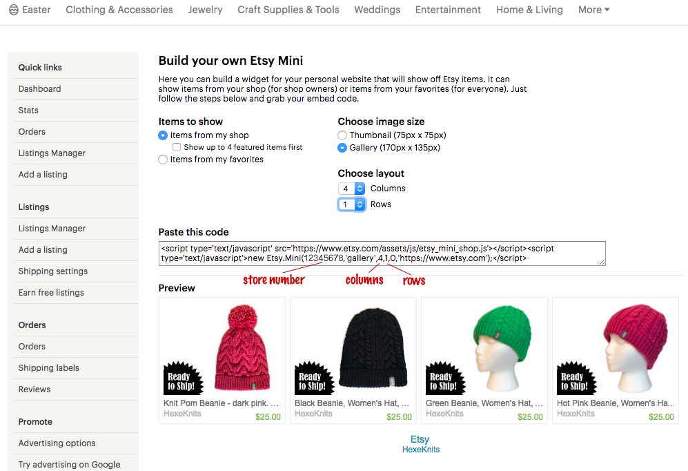
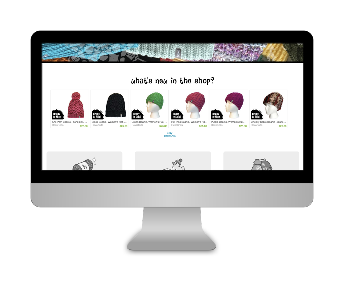
From the screenshot you'll see I've chosen to show one row with four columns of products from my shop (my awesome shop full of super cute beanies!) at gallery size. Looks great! And below that is a link back to Etsy and one directly to my shop.
The Paste this code box allows me to copy the code to paste into my website wherever I'd like it to show up. Worked like a charm but didn't look right when the screen was too wide or I looked at my website on my phone. On a wide screen the four-column widget looked really teeny and weird, and on the phone it blew out the right side because there just isn't room for all that on a phone. Ironically the Etsy Mini was too big!
With so many people using smartphones it's a big mistake to have a website that phone users can't use comfortably. It's vital to make sure a website is able to adapt to different screen sizes (geek term: responsive layout) and make the user experience a good one for your customers regardless of what type of device they're using.
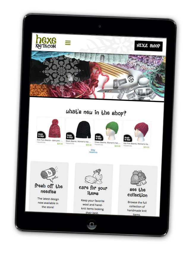
So, with the help of a little code magic (simple HTML and CSS), I made the widget a little smarter so it would know to show two columns on a phone-sized screen, keep the four on a tablet, and add two more to better fit a large desktop computer monitor.
This is an easy adjustment, made possible by a little extra markup. Here's what I did:
Basically what's happening here is I've set up three different widgets, each with a different number of columns. On large screens I show six hats. This is decided on the line for each where it says 'gallery', 6,1,0. (See Build Your Own Etsy Mini page screenshot above for reference.) Then only four on small screens and tablets, and on the phone there are two. To make a three-column, two-row piece you'd change that to read 'gallery', 3,2,0.
Important if you're copying/pasting the code above: Be sure to update the 12345678 to your store ID! You can get this from the code provided on the Build Your Own Etsy Mini page. (See Build Your Own Etsy Mini page screenshot above for reference.)
Pro Tip: It's better practice to add everything between the style tags to the CSS file, but for clarity and ease of copy-and-paste-ability I have it all together here in a big chunk.